
Part 1
Part of the GIS course I’m currently enrolled in has us working on a large final project this semester. This week we are working on the data acquisition part of the project, as the larger project (and my posts about it) will be helpfully broken up into more manageable chunks over the next couple months.
When pondering about what topic I wanted to investigate as part of my project, I hit upon an idea – at the time I was driving – what if I could in some somewhat scientific way figure out which state of the United States of America had the “worst” drivers? I grew up in a different state of the US from the one in which I now live and it is funny to me to hear people from either/both states comment on the “horrible” driving of people from either their own state, or another one close by. Time to resolve this once and for all – who’s really the worst?
First though, to find some reputable, usable data upon which to form my analysis. After searching the web for “US auto accident data”, “automotive accident data USA” or similar, I was able to come across what I thought was quite a large dataset, on a website I had never heard of before – https://www.kaggle.com/.
It seems that this site is a repository of large datasets, often used to work with AI models, though I have yet to poke around much more on the site. The particular dataset that I was excited to come across is here – https://www.kaggle.com/datasets/sobhanmoosavi/us-accidents/data. In my understanding, this dataset is a collection of US automotive incidents/accidents ranging from 2016-2023, gathered through multiple sources and APIs and encompassing 49 US states. Each incident/accident is listed as a .csv row with, among other things, a latitude and longitude location and a severity rating from 1- 4. These are the two critical components to my analysis as is currently planned, along with the state in which the lat/long are located, as one of the .csv columns.
What I am hoping to do eventually in this project is to help normalize the data in such a way as to be able to compare number of accidents per state across US states with respect to state population and/or population density. I’m not sure how far or deep I’ll get into that analysis yet, but my goal is to answer my question “Which state has the worst drivers?” at least somewhat scientifically (and with a great looking map!).
ID	Source	Severity	Start_Time	End_Time	Start_Lat	Start_Lng	End_Lat	End_Lng	Distance(mi)	Description	Street	City	County	State	Zipcode	Country	Timezone	Airport_Code	Weather_Timestamp	Temperature(F)	Wind_Chill(F)	Humidity(%)	Pressure(in)	Visibility(mi)	Wind_Direction	Wind_Speed(mph)	Precipitation(in)	Weather_Condition	Amenity	Bump	Crossing	Give_Way	Junction	No_Exit	Railway	Roundabout	Station	Stop	Traffic_Calming	Traffic_Signal	Turning_Loop	Sunrise_Sunset	Civil_Twilight	Nautical_Twilight	Astronomical_Twilight

Example of the column headers from the dataset as downloaded
ID	Severity	Start_Time	End_Time	Latitude	Longitude	Description	Street	City	County	State	Zipcode

Column headers from the dataset after cleaning/removing data I deemed unnecessary for this project.
Interestingly enough, when searching for more information about the data’s column headers, I came across another project using what I believe is the same data, here – https://github.com/Aloysius-JW/US-accidents-2016-2023.
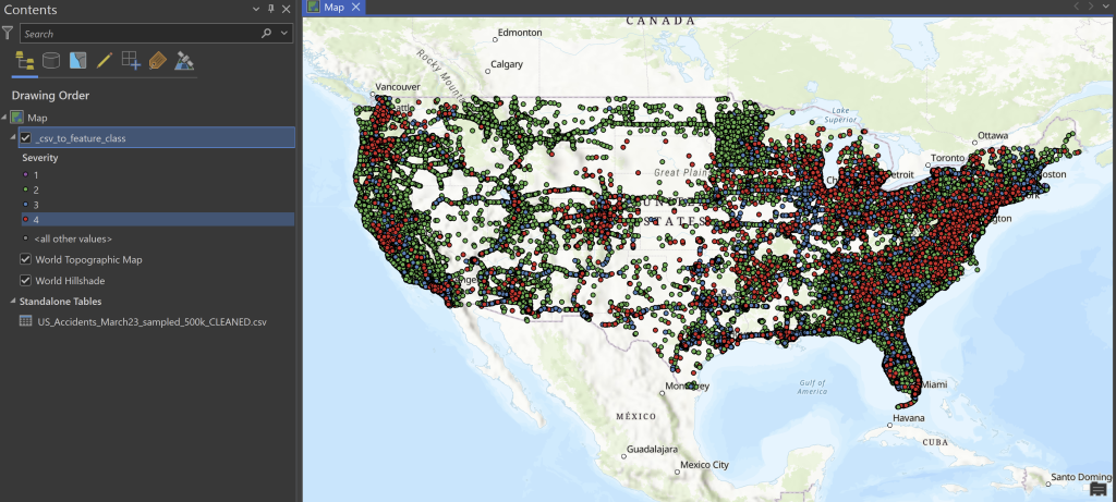
I have never personally come across a .csv file so large – 7.7 million records! Luckily for me, there is also available on the Kaggi page for this data a smaller sample of only 500k records. I’ve done a bit of work with the 500k dataset, but have not yet tested things with the 7.7 million. Below is an initial conversion from the 500k .csv file onto a map, using ArcGIS Pro’s XY Table to Point tool.
Our quest to find the state of residence of the real worst drivers in the US will continue in coming weeks.
References –
Moosavi, Sobhan. “US Accidents (2016 – 2023).” Kaggle, 28 May 2023, www.kaggle.com/datasets/sobhanmoosavi/us-accidents/data
Moosavi, Sobhan, Mohammad Hossein Samavatian, Srinivasan Parthasarathy, and Rajiv Ramnath. “A Countrywide Traffic Accident Dataset.”, 2019.
Moosavi, Sobhan, Mohammad Hossein Samavatian, Srinivasan Parthasarathy, Radu Teodorescu, and Rajiv Ramnath. “Accident Risk Prediction based on Heterogeneous Sparse Data: New Dataset and Insights.” In proceedings of the 27th ACM SIGSPATIAL International Conference on Advances in Geographic Information Systems, ACM, 2019.